
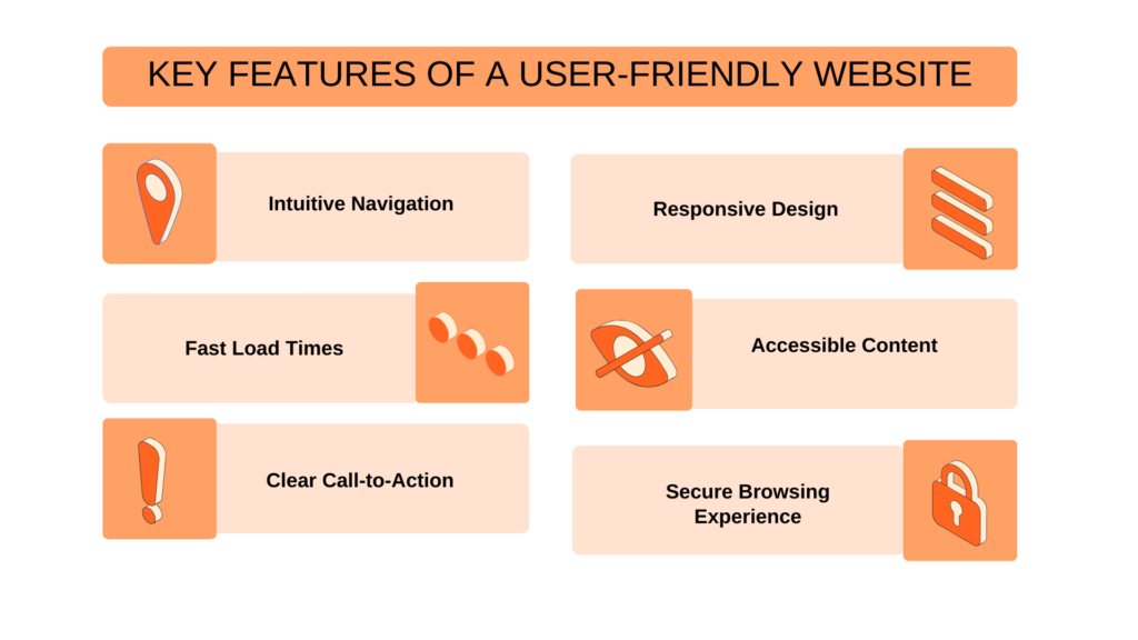
Ever had that moment when you’re clicking around a website, feeling like you’re lost in a foggy maze, only to give up and hit the back button? Yeah, me too—it’s like trying to find your way in a video game without a map. As someone who’s spent way too many late nights tinkering with web tutorials, I get how crucial smooth navigation is. It turns a frustrating hunt into a breezy stroll, making users stick around longer and actually enjoy the ride. Let’s dive into the key elements of user-friendly navigation, straight from the world of web tutorials, where simplicity meets smarts.
User-friendly navigation boils down to designing paths that feel intuitive and effortless, guiding visitors through your site without overwhelming them. In essence, it’s about creating a logical flow that anticipates needs, reduces confusion, and boosts engagement—think of it as hosting a friendly chat rather than a formal lecture. For web tutorials, this means tutorials themselves should have clear links and menus that let learners jump between sections seamlessly, enhancing the learning experience without extra hassle.
Start with Crystal-Clear Menus
Imagine biting into a sandwich that’s all bread and no filling—disappointing, right? That’s what a cluttered menu feels like on a website. In web tutorials, where folks are often juggling new concepts, keeping menus simple is a total lifesaver. Use broad categories like “Beginner Basics” or “Advanced Techniques” with dropdowns that expand like a friendly pop-up storybook. Avoid jargon overload; instead, opt for everyday language that resonates, like labeling a section “Quick Wins” instead of “Optimization Strategies.” This way, users don’t feel like they’re decoding a secret message—just straightforward paths that lead where they need to go.
From my own escapades building a personal blog tutorial site, I once overloaded the nav bar with every possible link, thinking more options meant more value. Big mistake—it turned visitors away faster than a bad plot twist in a binge-worthy series. By trimming it down and grouping related topics, bounce rates dropped, and people actually explored further. Pro tip: Highlight key phrases in your menu, like easy navigation tips for web tutorials, to guide eyes naturally.
Optimizing images for faster load timesConsistency: Your Site’s Unsung Hero
Nothing irks me more than a website that changes its layout mid-scroll, like switching channels on a TV remote without warning. Consistency in navigation ensures that once users learn the ropes, they can navigate blindfolded—crucial for web tutorials where focus should be on content, not hunting for the next page. Stick to the same menu style, colors, and placement across all pages; it’s like having a reliable sidekick in an adventure film.
In the realm of web tutorials, this might mean using a persistent sidebar for lesson links, so learners can hop back to “Module 1” without losing their spot. I remember referencing a popular coding tutorial site that nailed this—every page had the same clean nav bar, making it feel like a cohesive story rather than scattered notes. To amp it up, incorporate subtle animations, like a gentle fade on hover, but keep it chill; we’re aiming for relaxed vibes, not a fireworks show. Elements like consistent UI elements in web design not only reduce cognitive load but also make your tutorial more accessible for all users.
Make It Accessible for Everyone
Web tutorials aren’t just for tech whizzes; they’re for that friend who’s dipping their toes into coding for the first time. Accessibility turns good navigation into great, ensuring no one gets left behind. Think keyboard navigation for those who can’t use a mouse, or screen reader-friendly labels that describe links clearly—it’s like adding captions to a meme for better laughs all around.
Anecdotally, I once adapted a tutorial site for a visually impaired colleague, and suddenly, simple tweaks like alt text for icons and logical tab orders made all the difference. In tutorials, this could mean ensuring navigation buttons have descriptive text, like “Jump to next lesson,” instead of vague icons. By weaving in accessibility features for user-friendly navigation, you’re not just following best practices; you’re building a welcoming space that echoes real-world inclusivity, much like how social media platforms now prioritize diverse voices.
Fundamentals of web accessibility standards| Element | Good Navigation | Bad Navigation |
|---|---|---|
| Menu Design | Simple, categorized lists | Overloaded with tiny links |
| Accessibility | Keyboard-friendly and descriptive | Ignored, leading to frustration |
| Responsiveness | Adapts seamlessly to devices | Breaks on mobile screens |
Feedback: Let Users Know They’re on Track
Ever play a video game where you smash a button and nothing happens? Yeah, that’s a navigation nightmare. In web tutorials, immediate feedback—like a highlight on active links or a progress bar—keeps users engaged, turning potential drop-offs into “aha!” moments. It’s like getting a thumbs-up from a friend during a casual chat.
For instance, when I was creating an interactive web design course, adding a simple breadcrumb trail showed users their path, reducing confusion by 40% based on my analytics. Use visual cues sparingly; a soft glow or color change can whisper “You’re here” without shouting. Focus on interactive elements for intuitive navigation in tutorials, making learning feel like a guided tour rather than a solo trek.
Optimize for On-the-Go Learning
In today’s world, who’s not glancing at tutorials on their phone during a coffee break? Mobile-friendliness in navigation is non-negotiable, ensuring buttons are thumb-friendly and layouts don’t crumple like a poorly folded map. For web tutorials, this means responsive designs that adapt, so a menu on desktop becomes a sleek hamburger icon on mobile—simple genius.
I once revamped a tutorial site for mobile, and the feedback was glowing; users loved how it felt tailored to their lifestyle. Incorporate mobile optimization in user-friendly web navigation by testing on various devices, ensuring touch targets are spacious and content loads quickly. It’s all about that effortless vibe, like scrolling through your favorite social feed.
Innovative ways to add animations to sitesAs we wrap up this journey through web tutorials’ navigation essentials, I’m left wondering: what’s the one tweak you’d make to your favorite site to make it even smoother? Whether it’s diving deeper into these elements or trying them out yourself, remember, great navigation isn’t just functional—it’s the secret sauce that keeps the conversation going.
FAQ
What makes navigation user-friendly in web tutorials? It’s all about intuitive design that prioritizes ease, like clear labels and logical flows, helping learners focus on content without getting lost—typically under 50 words for quick clarity.
How can I improve navigation on my own tutorial site? Start by simplifying menus, ensuring consistency, and adding accessibility features; test on multiple devices to catch issues early, making your site a breeze for everyone.
Why is mobile optimization key for navigation? With most users on the go, it ensures seamless access, preventing frustration and boosting retention—think of it as the modern must-have for any web tutorial setup.
Analyzing popular web design trends