
Ever tried squinting at a website on your phone, only to give up because it looks like a jumbled mess? Yeah, me too—that’s the frustration that got me hooked on responsive design in the first place. Picture this: I’m scrolling through my favorite blog on a tiny screen, and suddenly, buttons are overlapping, images are cut off, and I’m one tap away from closing the tab. It’s like trying to eat soup with a fork—utter chaos. But here’s the good news: responsive website design fixes all that, making your site adaptable no matter the device. And if you’re diving into internet tutorials, understanding its core elements is like unlocking a superpower for your web projects.
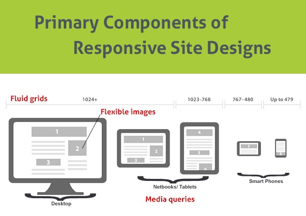
The core elements of responsive website design revolve around creating sites that fluidly adjust to different screen sizes, from desktops to smartwatches. At its heart, it’s about flexible grids, media queries, and a mobile-first mindset to ensure everything loads smoothly and looks intentional. Think of it as dressing for the weather—you wouldn’t wear a winter coat in summer, right? So, why force a website to wear the same layout everywhere? This approach not only boosts user experience but also helps with SEO, as search engines favor mobile-friendly sites. In essence, if you’re building or tweaking a site, mastering these elements means your audience stays engaged, no matter how they’re accessing it.
Let’s break this down a bit more. One of the first things I learned in my own internet tutorials journey was how flexible grids and layouts form the backbone of responsive design. Imagine a grid as a dynamic blueprint for your page, where elements shift and resize based on the viewport. Instead of rigid columns that break on smaller screens, you use CSS Flexbox or Grid to let things flow naturally. For instance, on a desktop, you might have a three-column layout for your portfolio, but on a phone, it stacks into a single column—seamless and user-friendly. It’s like rearranging furniture in a room to fit more people; everything adapts without losing its charm.
Why Flexible Grids Are Your Best Friend in Web Design
Diving deeper, flexible grids aren’t just about aesthetics; they’re practical magic for internet creators. Back when I was starting out, I remember experimenting with a personal blog and realizing how a fixed-width design made my content unreadable on tablets. That’s where percentage-based widths and auto-adjusting elements come in—they scale proportionally. Pair this with media queries, which are basically conditional statements in CSS that say, “Hey, if the screen is smaller than 768px, switch to this style.” It’s like having a chameleon website that changes colors to match its environment. And let’s not forget breakpoints; these are the sweet spots where your design shifts, ensuring that your site doesn’t just survive but thrives across devices.
Steps for setting up a personal blog onlineIn my experience, adding a touch of humor to tutorials helps—it reminds me of that viral meme about websites that only work on specific browsers. You know, the ones with the crying cat? Well, responsive design is the antidote, preventing those “view on desktop only” nightmares. By focusing on a mobile-first approach, you prioritize the smallest screens and build up, which not only cuts down on load times but also encourages cleaner code. It’s a nod to how most people browse the web these days, thumb-scrolling on their phones during commutes or coffee breaks.
Mastering Media Queries and Images for Seamless Adaptation
Now, let’s talk media queries and responsive images, because no tutorial on internet design is complete without them. Media queries let you target specific device features, like screen width or orientation, to apply custom styles. For example, you could hide certain navigation elements on mobile to save space, making the interface less cluttered. I once redesigned a friend’s e-commerce site using this, and the difference was night and day—sales actually picked up because users could shop easily on their phones. As for images, using the srcset attribute ensures that high-res photos don’t bog down mobile data; instead, they serve optimized versions based on the device’s capabilities. It’s like having a smart delivery service that knows exactly what size package to send.
If you’re following along with your own projects, here’s a quick step-by-step to get started:
1Set up your HTML structure with a flexible container, like a div using display: flex.
Tips on improving your internet security basics2Add media queries in your CSS, such as @media (max-width: 600px) { /* adjust styles here */ } to handle mobile views.
3Test everything on different devices or use browser tools to simulate responsiveness, tweaking as you go.
This isn’t rocket science, but it does take a bit of trial and error, which is the fun part of internet tutorials. Oh, and for a visual comparison, here’s a simple table to weigh the pros and cons:
| Element | Advantages | Challenges |
|---|---|---|
| Flexible Grids | Easy adaptability, better user flow | Requires learning CSS properties |
| Media Queries | Precise control over layouts | Can lead to overly complex code if overused |
| Mobile-First Approach | Improves performance and accessibility | Might need redesign for larger screens |
Overcoming Common Hurdles in Responsive Design
Of course, it’s not all smooth sailing. One hurdle I often see in internet tutorials is forgetting about touch interactions—buttons that work fine with a mouse can be a nightmare on touchscreens. Make sure they’re large enough and spaced out; think about how you’d navigate with one hand while holding a coffee. Another is performance—responsive sites can load slower if not optimized, so compress those images and minify your CSS. It’s like packing for a trip: you want everything essential without the extra weight.
Best strategies for social media engagementAs we wrap up this laid-back dive into responsive design, imagine the satisfaction of seeing your site shine on every device. Whether you’re a beginner or brushing up, these core elements are your toolkit for the modern web. So, what’s your next move—time to experiment with that pet project?
FAQ: Quick Answers to Your Responsive Queries
What is the most important tool for responsive design? Media queries are key, as they allow your CSS to respond to different screen sizes dynamically, making your site truly adaptable.
How does responsive design affect SEO? It boosts it by improving mobile usability, which Google prioritizes, potentially increasing your site’s rankings and visibility.
Can I make an existing site responsive? Absolutely, with some CSS tweaks and testing, but it might require a redesign if the original structure isn’t flexible.
Common mistakes in online password management